
User interview conducted on Zoom
Providing nutritional insights and smart recommendations while grocery shopping
UX Researcher & Designer
April 2021 – June 2021
Hannah Chu (UX Researcher & Designer), Ophelia Yang (UX Researcher & Designer), Shirley Tang (UX Researcher & Designer)
User Interviews, Contextual Inquiry, User Flows, Wireframing, Prototyping, Usability Testing
Figma, Whimsical
In this project, we adopted a highly experimental design approach presented by the UCLA Human-Computer Interaction lab: AI41, designing for one user. We were tasked to identify one person and design an app, service, or device that uses AI to fulfill that person’s needs in some way.
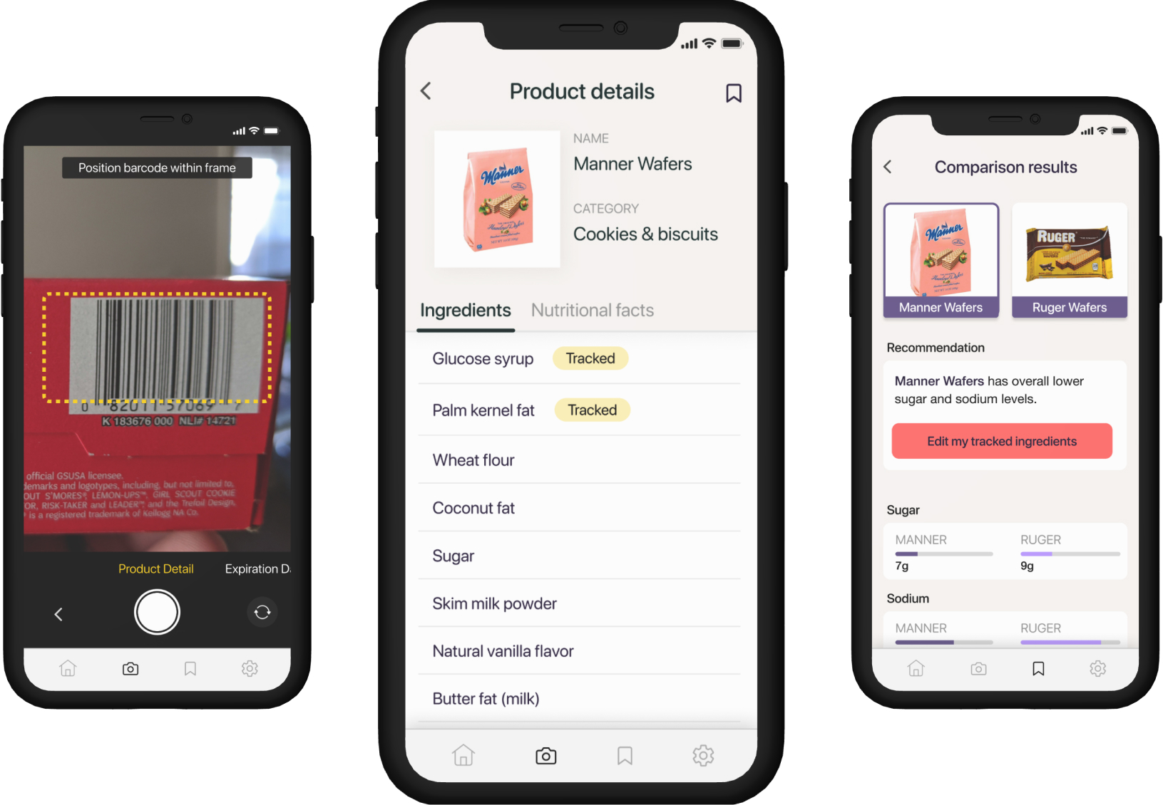
Our solution was Grocery Buddy: an AI-enabled application that can scan product barcodes and extract relevant product information and recommendations based on nutritional facts. We focused the app with the intentions to enhance the grocery shopping process for users who have difficulty reading fine text.
As a UX researcher and designer, I conducted research with one user to design and test an accommodating experience learning about and comparing products.
User interview conducted on Zoom
Shirley's mom
In recent years, it has become more difficult for my mom to read smaller sized print. Even with reading glasses, she often does not bring them with her when she goes out and gets frustrated when she is unable to read small labels.

We interviewed our user and found pain points around:
1. Difficulty reading ingredients on product labels due to narrow line spacing
2. Text of food labels being unreadable due to size or color contrasts
3. Challenges finding expiration dates on products easily
From our interview, we revised our problem statement and narrowed down a few main points of interest around text size, line spacing, highlighting key words (e.g. sodium, sugar, msg), and contrast and coloring.

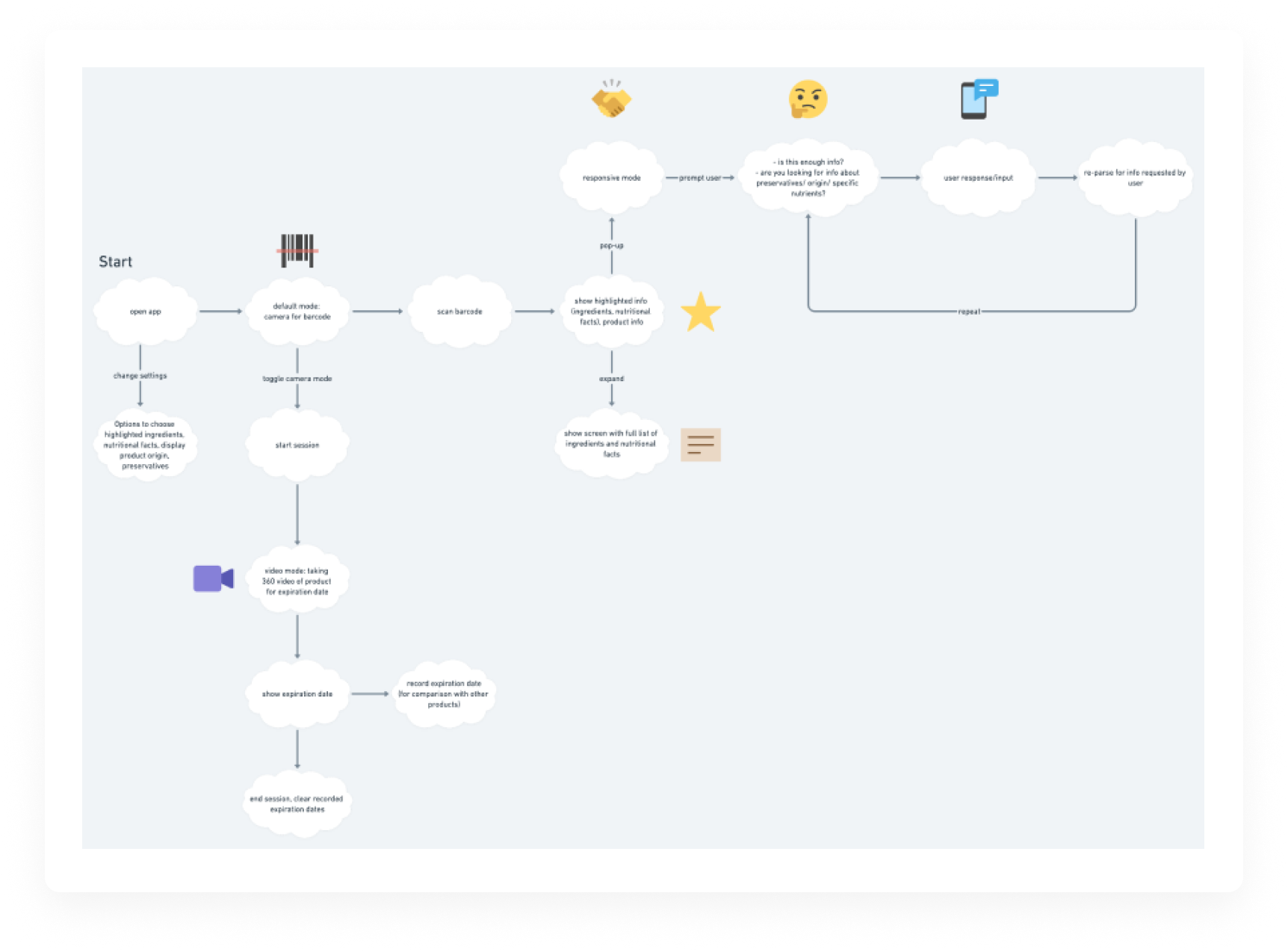
User flow outlining interactions with the app's scanning modes
Our first prototype focused on three main functionalities: a bar code scanning mode, expiration date identifier, and nutritional facts comparison feature.

Low-fidelity wireframes of the scanning and information extraction features
I worked on the video scanning mode for expiration dates, as well as settings and interactions for saving items and nutritional facts.

Mockups from prototype 1
Main takeaways from usability testing the first prototype included:

Missing Call to Action

Colors Convey Unclear Meaning

Picture Size is Not Accessible

Past Information Irrelevant to User’s Needs
We revised colors, font sizes, and calls to action to be more intuitive to the user.

Applying findings from research to prototype 2
I later revisited this project to challenge myself and improve the UI, starting with mid-fidelity wireframes and slowly making my way up to redesigning components.

Mid-fidelity wireframes of redesign

Scan product barcodes to get product information.

Easily access a list of ingredients and nutritional facts.

Scan products and find when a given product is expiring.

Select two products to compare nutritional information.

